Responsive Web Design Services Chennai
Mobile devices now account for the majority of internet traffic worldwide, and most visitors will judge your business within seconds of loading your website on their phone. If that experience is slow, cramped or hard to navigate, they leave and rarely come back.
Google’s mobile-first indexing makes this even more critical, since search rankings are now based primarily on how well your site performs on mobile. That is why businesses in Chennai are actively searching for a Responsive Web Design Company Chennai can rely on to future-proof their online presence heading into 2026.
From startups in Chennai, Tamil Nadu launching their first website to established enterprises redesigning outdated platforms, the demand for Mobile-Friendly Website Design has never been higher. Businesses that delay this shift risk losing visibility, credibility and revenue to competitors who have already made the move.
What Are Responsive Web Design Services?
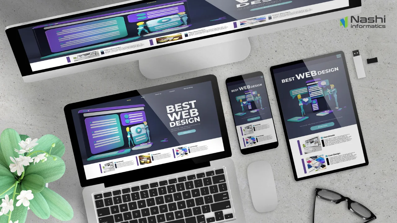
Responsive Web Design Services build websites that automatically adjust their layout, images and navigation to fit any screen, from a small smartphone to a large desktop monitor. Instead of maintaining separate mobile and desktop versions, one flexible codebase reshapes itself using fluid grids and breakpoints.
This differs from adaptive design, which relies on multiple fixed layouts for specific devices and requires more ongoing maintenance. Businesses investing in Mobile-Friendly Website Design today are choosing the more scalable option, since responsive sites adapt automatically to new devices and screen sizes without a full rebuild.
Why Businesses in Chennai Need Responsive Web Design Services
A manufacturing company in Guindy that still runs a desktop-only website is losing enquiries every day to competitors whose sites load cleanly on a buyer’s phone during a factory visit. This kind of gap is common across local industries.
Responsive Web Design Services Chennai businesses invest in deliver a better user experience, stronger Google rankings, higher mobile conversions and lower bounce rates. A polished, fast-loading site also builds brand credibility, which matters when customers are comparing several vendors before making a decision.
Healthcare providers, educational institutions and logistics companies across the city are seeing the same pattern: visitors who land on a cluttered, non-responsive page rarely stay long enough to read a single service page, let alone fill out an enquiry form.
Key Benefits of Mobile-Friendly Website Design
Better User Experience
Visitors can browse, read and click through your site effortlessly on any device, which keeps them engaged instead of frustrated and exiting within seconds.
Higher Search Engine Rankings
Since Google evaluates the mobile version of your site first, a responsive structure directly supports better visibility in search results.
Increased Lead Generation
Forms, click-to-call buttons and CTAs that work smoothly on mobile convert significantly more visitors into enquiries and customers.
Improved Website Performance
Optimized code and images used in responsive builds reduce load times, which keeps impatient mobile users from abandoning the page.
Better Customer Engagement
A consistent, easy-to-use experience across devices encourages visitors to explore more pages and spend longer on your site.
Essential Features of a Responsive Website
Not every website labelled responsive actually performs well across devices. A genuinely effective build relies on a specific set of technical and design fundamentals, each contributing directly to speed, usability and search visibility.
- Mobile-First Layout designed for smaller screens first, then scaled up for larger devices.
- Flexible Grid System content reflows smoothly across any screen width.
- Optimized Images compressed visuals that load quickly without losing quality.
- Fast Loading Speed directly affects rankings, user patience and conversions.
- Touch-Friendly Navigation buttons and menus sized correctly for fingers, not just cursors.
- SEO-Friendly Structure clean code and semantic markup that search engines can crawl easily.
- Accessibility Compliance ensures the site is usable for visitors with disabilities.
- Cross-Browser Compatibility consistent appearance across Chrome, Safari, Edge and Firefox.
Together, these features form the backbone of Custom Web Design that performs reliably no matter how or where a customer finds your business online.
Industries That Benefit from Responsive Web Design
Healthcare
Patients often search for clinics on their phones while dealing with an urgent issue; a fast, mobile-friendly site with easy appointment booking reduces friction and increases bookings.
Education
Prospective students research institutions primarily on mobile; a responsive site with clear course information and enquiry forms improves admission enquiries.
Retail
Shoppers browse and compare products on their phones constantly; a responsive storefront with fast-loading product pages reduces cart abandonment and boosts sales.
Manufacturing
B2B buyers often review supplier websites during site visits or meetings; a responsive, professional site builds credibility and speeds up vendor shortlisting.
Real Estate
Property seekers browse listings on mobile while on the move; responsive galleries and quick contact options help convert interest into site visits.
Professional Services
Clients researching consultants or agencies expect a polished mobile experience; a responsive site with clear service pages builds trust before the first call.
Why Choose Nashi Informatics Solutions for Responsive Web Design Services in Chennai?
Businesses across Tamil Nadu choose Nashi Informatics Solutions because every website is custom-built around real business goals, not templated designs that look the same as every competitor.
- Custom responsive website development tailored to your brand and audience
- Mobile-first UI/UX expertise focused on usability and conversions
- SEO-ready website architecture built for long-term organic growth
- Fast-loading websites optimized for Core Web Vitals
- Accessibility-focused design that welcomes every visitor
- Ongoing website support and performance monitoring
- Business-driven web solutions connected to your marketing strategy
As Nashi Informatics Solutions, the team pairs website builds with broader Website & Digital Marketing Services, ensuring your new site is designed to actually generate leads, not just look good.
Responsive Web Design Trends Shaping 2026
AI-Powered Personalization is enabling websites to adjust content and layout based on visitor behavior in real time, while Progressive Web Apps (PWAs) let businesses offer app-like speed and offline functionality without building a separate native app https://www.nashiinfo.com/web-development Core Web Vitals Optimization continues to directly influence rankings, and Accessibility-First Design is becoming a baseline expectation rather than an afterthought. Dark Mode Support and subtle Motion UI are also rising in popularity, giving modern sites a more polished, engaging feel.
Common Responsive Web Design Mistakes Businesses Should Avoid
Even well-intentioned website projects can fall short if a few common pitfalls go unnoticed during design and development. Avoiding these mistakes early saves significant time, budget and lost leads down the line.
- Ignoring Mobile Users designing for desktop first still leaves the majority of visitors with a poor experience.
- Slow Loading Pages every extra second of load time increases bounce rates and lost leads.
- Poor Navigation confusing menus frustrate visitors and hurt conversions.
- Unoptimized Images large, uncompressed files slow down mobile browsing significantly.
- Weak CTA Placement buried or unclear calls-to-action mean fewer enquiries reach your team.
How Responsive Web Design Supports Digital Marketing Success
A responsive website amplifies every other marketing channel: Responsive Design and SEO work together since Google favors mobile-optimized sites, while Responsive Design and Google Ads ensure paid traffic lands on a page that actually converts instead of bouncing.
The same applies to Responsive Design combined with Social Media Marketing, WhatsApp Marketing and Content Marketing, since every campaign eventually drives traffic back to your website. You can Explore Our Web Design Insights to see how a strong website foundation improves results across every digital channel.
Future of Responsive Web Design
The next wave of website experiences is moving toward AI-powered personalization, where layouts and content adjust automatically to each visitor’s intent and behavior.
Voice search optimization, device-independent interfaces and intelligent UX optimization will increasingly shape how businesses design for a growing range of screens, assistants and browsing habits over the coming years.
Conclusion
Responsive web design is no longer a nice-to-have; it directly affects how customers experience your brand, how well your site ranks on Google, and how many visitors convert into genuine business leads. A mobile-friendly, fast, well-structured website has become a baseline requirement for growth in 2026.
Working with an experienced Responsive Web Design Company Chennai businesses trust makes the difference between a website that simply exists and one that actively drives revenue. Nashi Informatics Solutions combines custom design, mobile-first development and SEO-ready architecture to build sites that perform. If you’re ready to upgrade your website, with the Nashi Informatics team today Request a Free Website Consultation
Latest Blogs
-
 Google Ads Management Services in Chennai: Maximize ROI with High-Performance PPC Campaigns in 2026
 -
How Professional Search Engine Optimization Helps Businesses Generate Consistent Organic Leads in 2026
-
UI/UX Design Services in Chennai: Create User-Centric Digital Experiences That Drive Business Growth in 2026
-
Google Business Profile Optimization Services Chennai: Rank Higher on Google Maps and Get More Local Customers in 2026
-
Website Redesign Services Chennai
-
WordPress Website Development Services Chennai: Build a Fast, Secure, and SEO-Friendly Business Website in 2026
-
SEO Services Chennai: Increase Organic Traffic, Google Rankings, and Qualified Leads for Your Business in 2026
-
WhatsApp Business API Services Chennai: Automate Customer Conversations and Increase Sales in 2026
-
Website Redesign Services Chennai: Transform Your Outdated Website into a High-Converting Business Asset in 2026
-
Responsive Web Design Services Chennai
-
WhatsApp Business API Services TamilNadu
-
Website Maintenance Services TamilNadu: Keep Your Business Website Secure, Fast, and Always Online in 2026
-
Social Media Marketing Services: Grow Your Brand, Increase Engagement, and Generate Quality Leads in 2026
-
Landing Page Development Services Chennai: Convert More Visitors into Qualified Business Leads in 2026
-
E-Commerce Website Development Services Chennai
-
Corporate Website Development Services Chennai: Build a Professional Business Website That Drives Growth in 2026
-
WhatsApp Marketing Services Chennai: Boost Customer Engagement and Generate More Business Leads in 2026
-
Local SEO Services Chennai
-
Website Redesign Services in Chennai
-
Professional Website Development Services: Build a Fast, SEO-Friendly Business Website That Converts in 2026